Onboarding in Augmented Reality Mobile Application
Article posted on
2019-11-25
Cases study of all ARKit apps on the App Store. Almost all.
After releasing ARKit, amount of augmented reality applications in the App Store started growing exponentially. Before on the App Store were tens of apps that were more or less useful. Now there are a lot of applications that are great and even more of them useless. An amount of new user growing respectively.
Using first time application with augmented reality is so exciting and obscure that it’s tough for the first-time user to understand and get value. There is some learning curve. With current best practices, gestures and interactions are natural and intuitive. The only thing that left for creators of AR apps only use them. We should try to make the onboarding process as maximum flawless.
To find out for myself basic steps and main pain points, I tested a massive amount of AR applications from App Store. Some of them are awful. Some of them are so great that I kept them on my home screen. Some of them I was not even able to get started.
After realizing how bad and bumpy can be an onboarding process for new users, I decided to prepare a case study of every step. After defining best practices, we’ll have a chance to focus more on apps and be sure that our users will understand and figure out how to use AR.
I added here tons of screenshots. Some of them show good approaches. Some of them are bad examples. I don’t want to promote or slander particular developers or apps. Even if one onboarding step isn’t right, the app can be great, or vice versa. So I’m not going to mention here names of apps and will not include links to App Store.
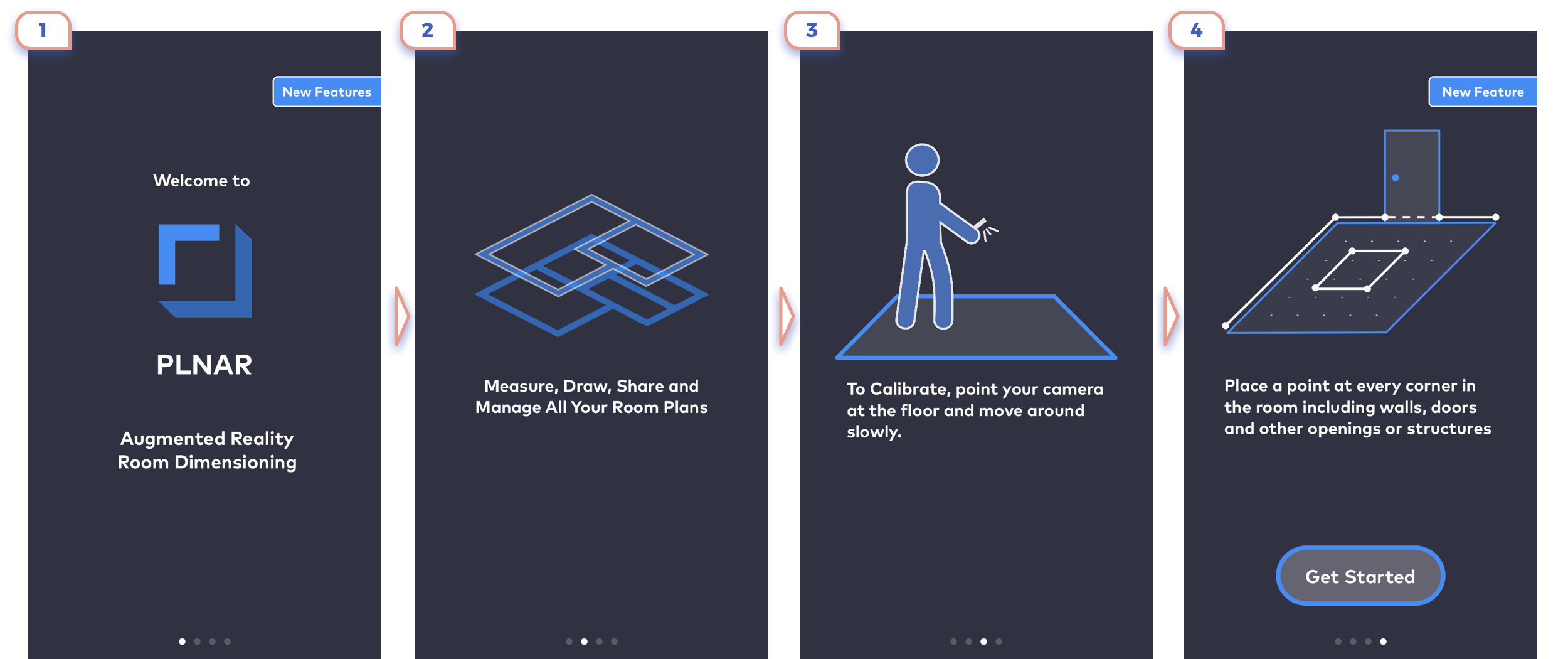
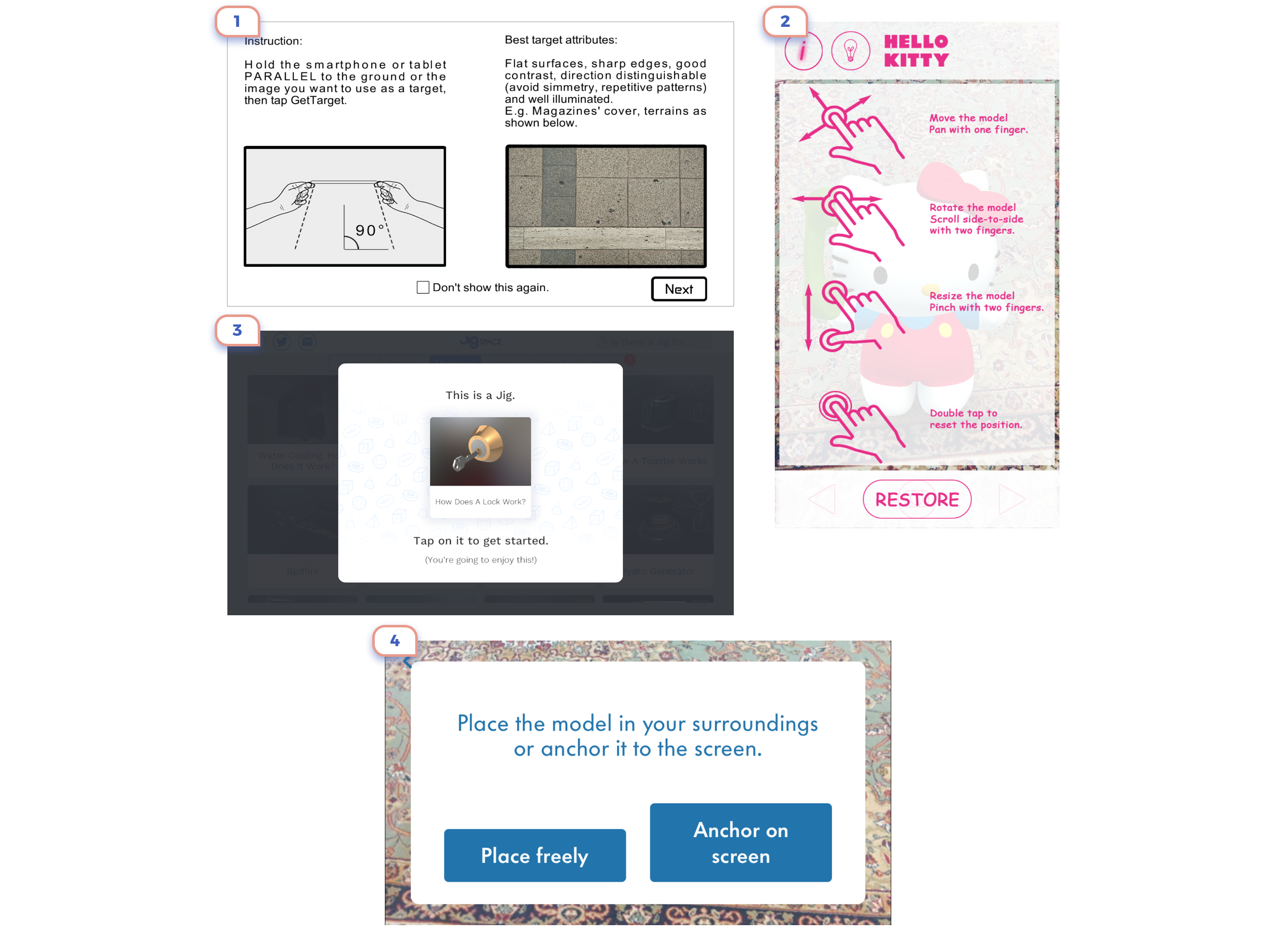
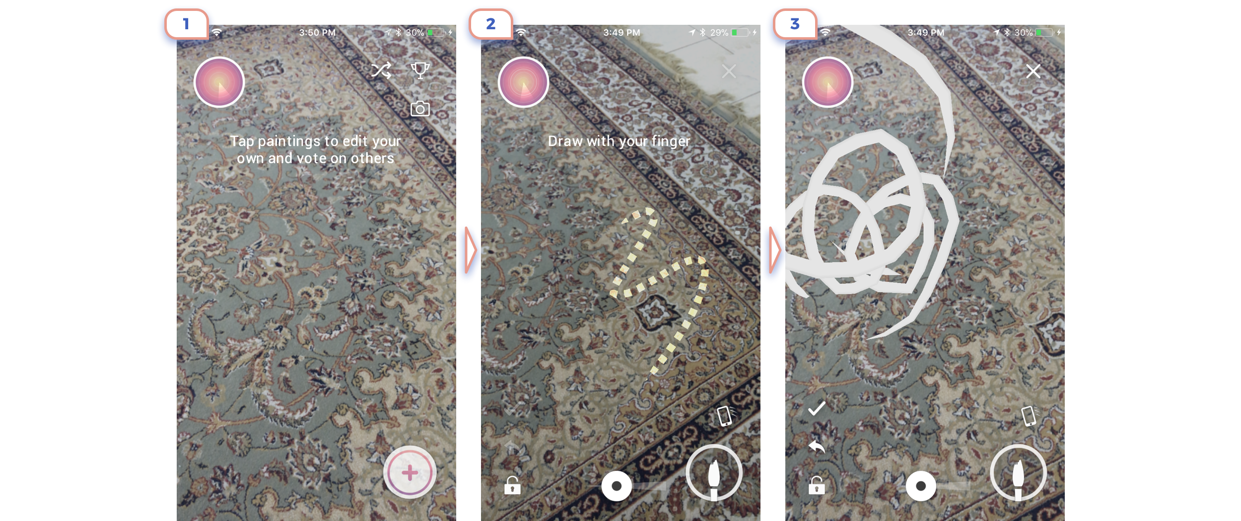
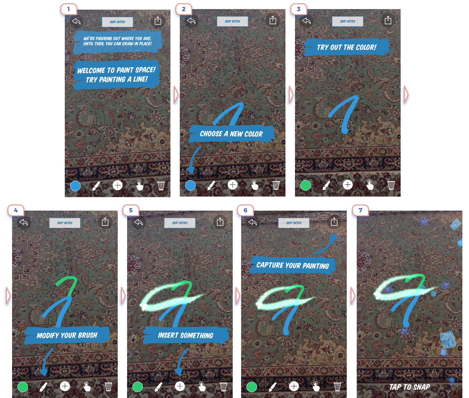
1. Walkthrough

After a user clicks on the cute icon and sees “Made in Unity” screen, he should get the main idea of what this app is about. In regular apps very popular is few steps walkthrough. Of course, everybody uses the option “Skip”, but it’s not such a bad way to make the first introduction.
The central question on this step is what is essential information for a user. So let’s have a look at real apps:
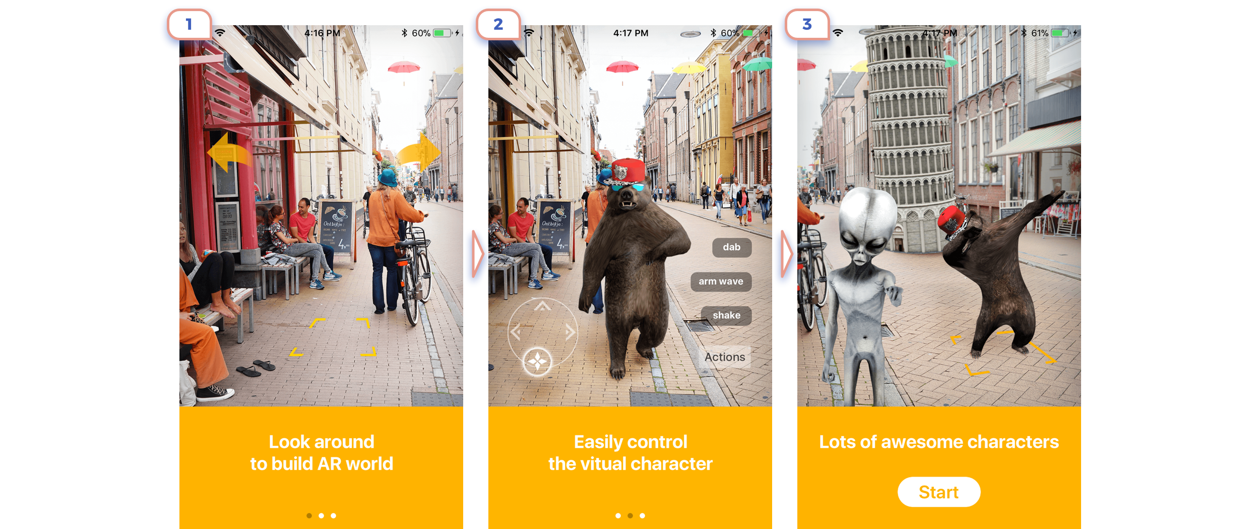
This is the perfect example. Only in 3 steps they show the main idea of what is AR about, explained that there are unique controls, and promoted app feature.
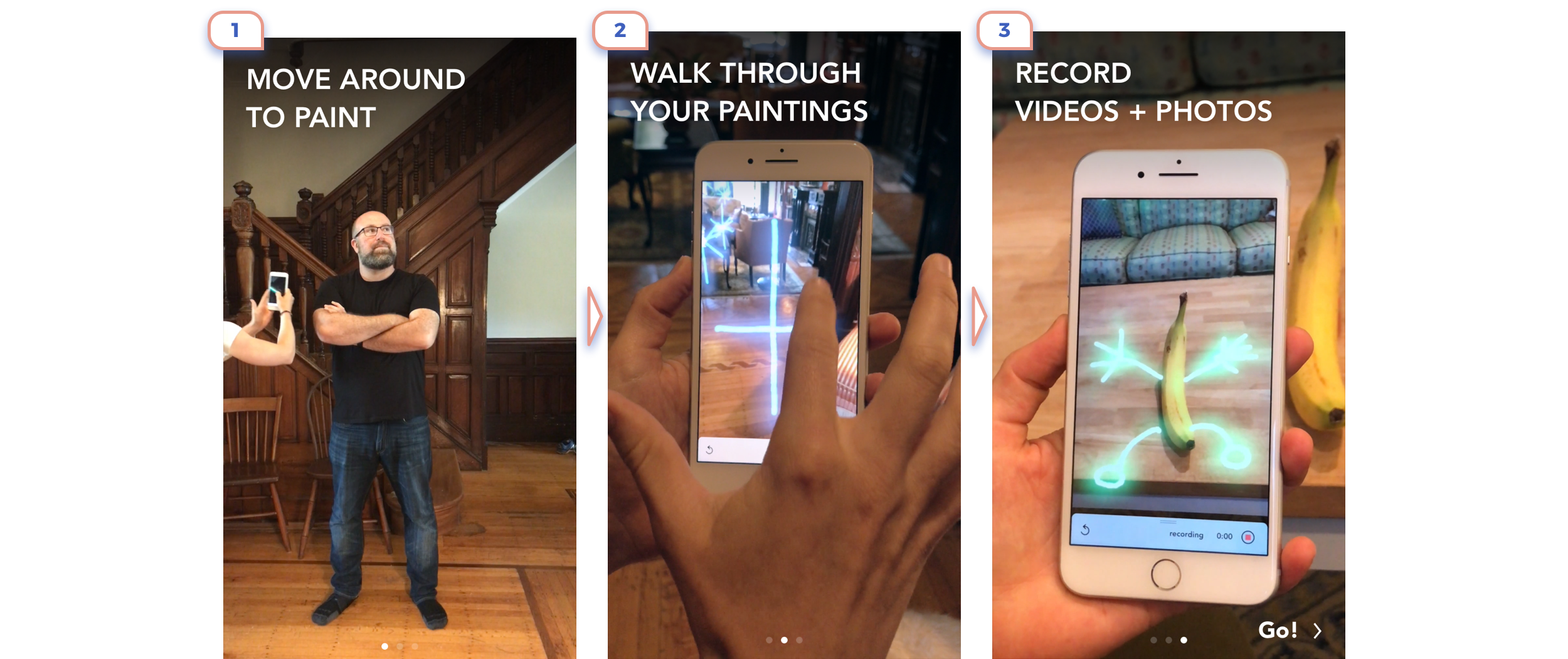
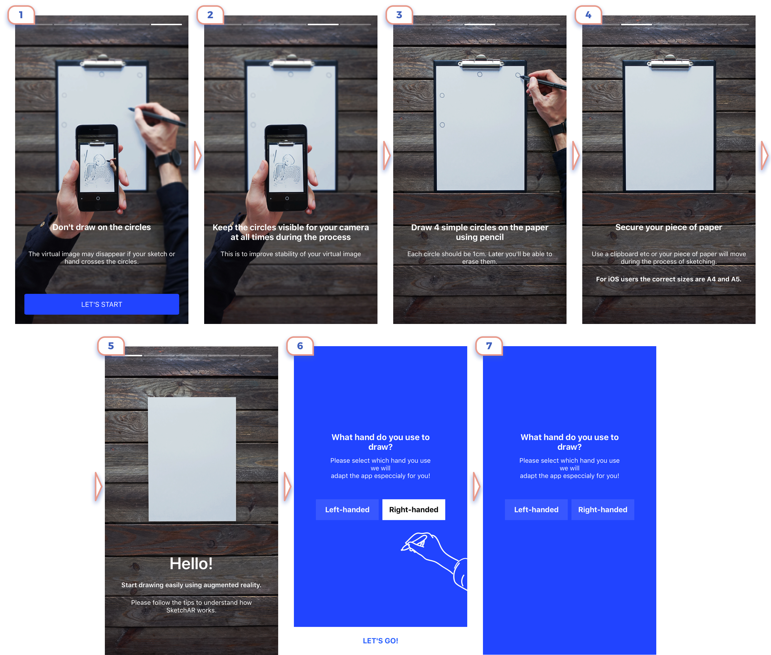
Another good case of explaining uniques app features. Interesting here is the use of videos to show how it works. Straightforward, but it works.
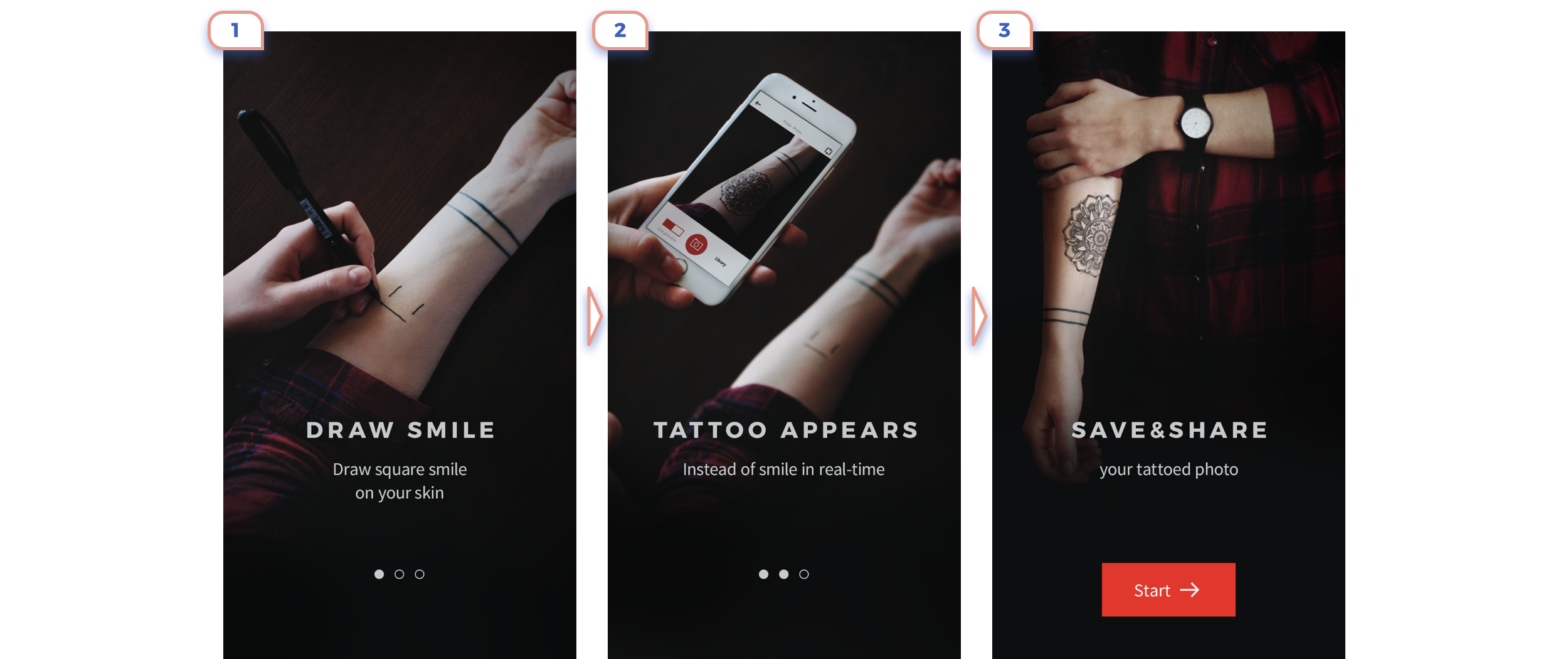
This app is form “Before ARKit Era”, therefore the user has to draw marker to place art. They explained very clearly complicated flow in only three slides.
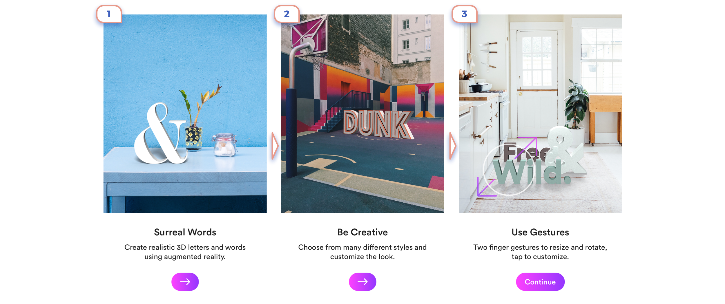
This option looks nice, but don’t give so much value to a user.
Good clean style. Not sure how useful are the first two slides. Information from the third and fourth slides is tricky to understand clearly.

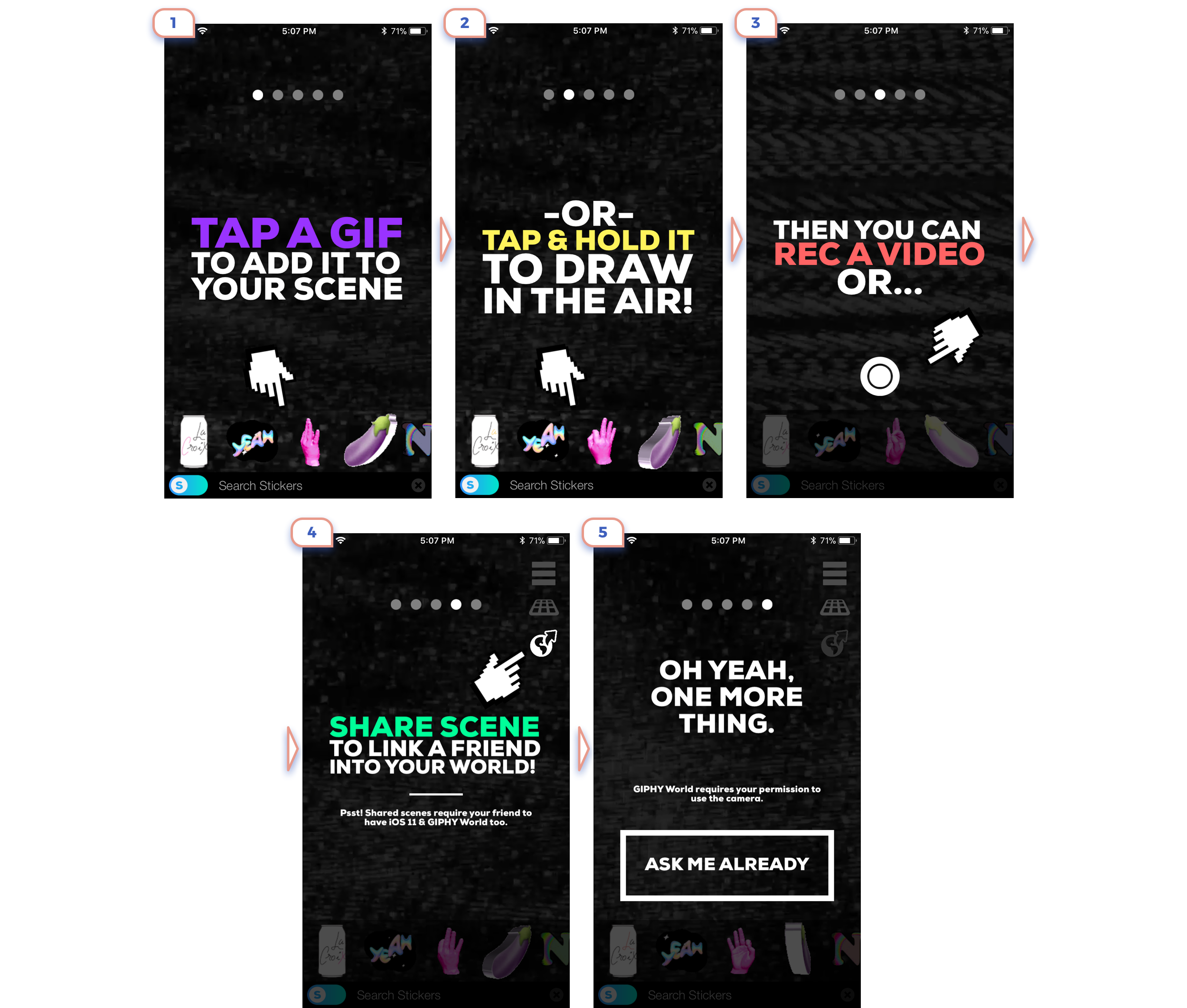
Few more examples from different apps:
1. Looks like all fine, but text explanation or advantages of AR placing objects in real-world conflicts with the full digital picture.
2. Don’t think that anybody will read a lot of dry text, especially the centre aligned.
3. Better not include more than one message on the screen as it makes all of them unreadable.
4. Again unreadable text on a top. This is the interesting case, as on-screen are two CTA: one starts playing video, another is “Start Measuring”. And not clear what is more important. I would like to know how many users started playing a video at all. Let’s be honest, no one wants to watch a video when he is few steps away from exciting augmented reality.
One more example from “Before ARKit Era”. Of course, questionary if this explanation could efficiently fit in fewer slides. But for future more critical is another idea: Don’t try to invent unique flow, use all known gestures will save you a lot of time on onboarding and lower exit rate.
This example looks rough, but it’s the style of the whole service. Bold titles are great here. They deliver a single and clear message at once.
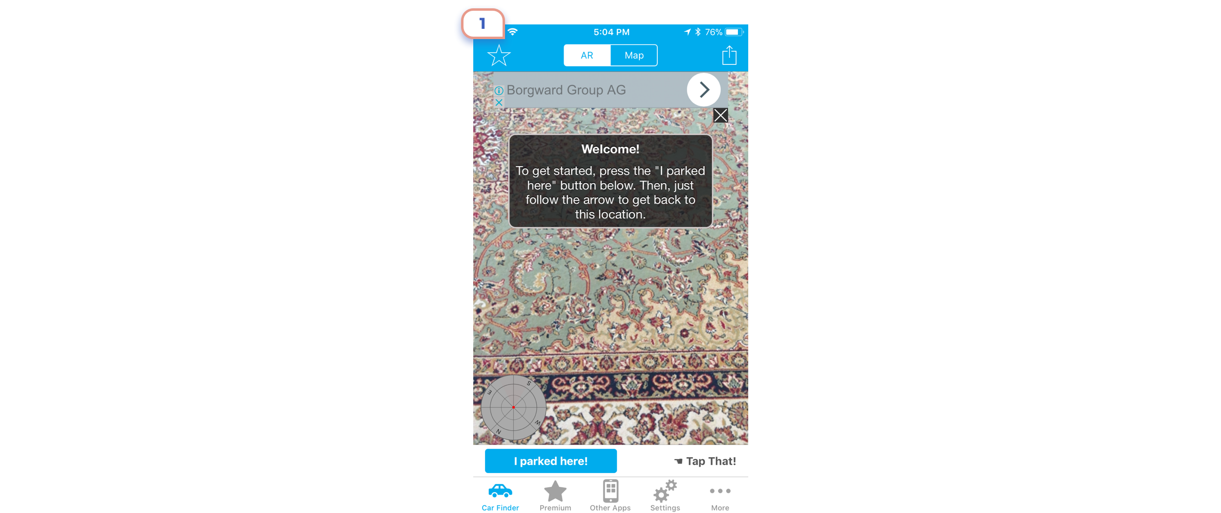
2. A request for access to the camera

Not a big deal to show the short message and request access to the camera in default dialogue. I’m as paranoid trying to keep an eye on what kind of access request every app.
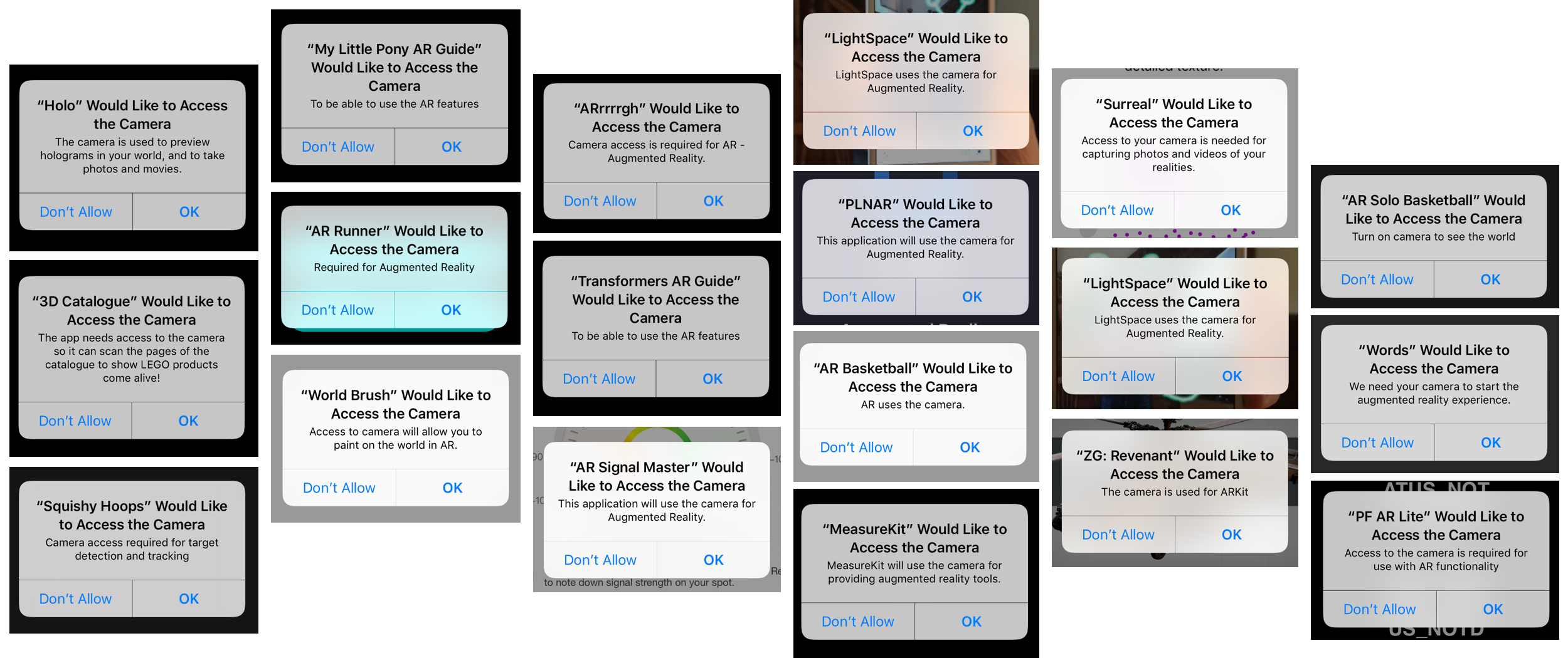
And most of the apps have more or less clear explanation that they need the camera for augmented reality.
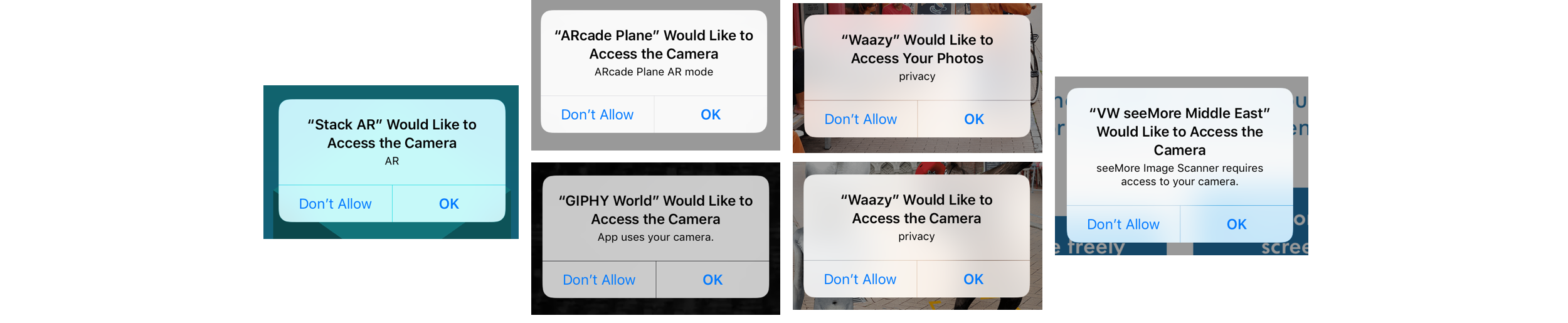
Some of the applications don’t care about explaining.
UPD by Liwei Yu: Apple already rejects applications without a clear description.


Some developers just skip description field at all.

Some come to this task with humour and creativeness.
3. Explanation
I moved it to separate step as it’s so unique.
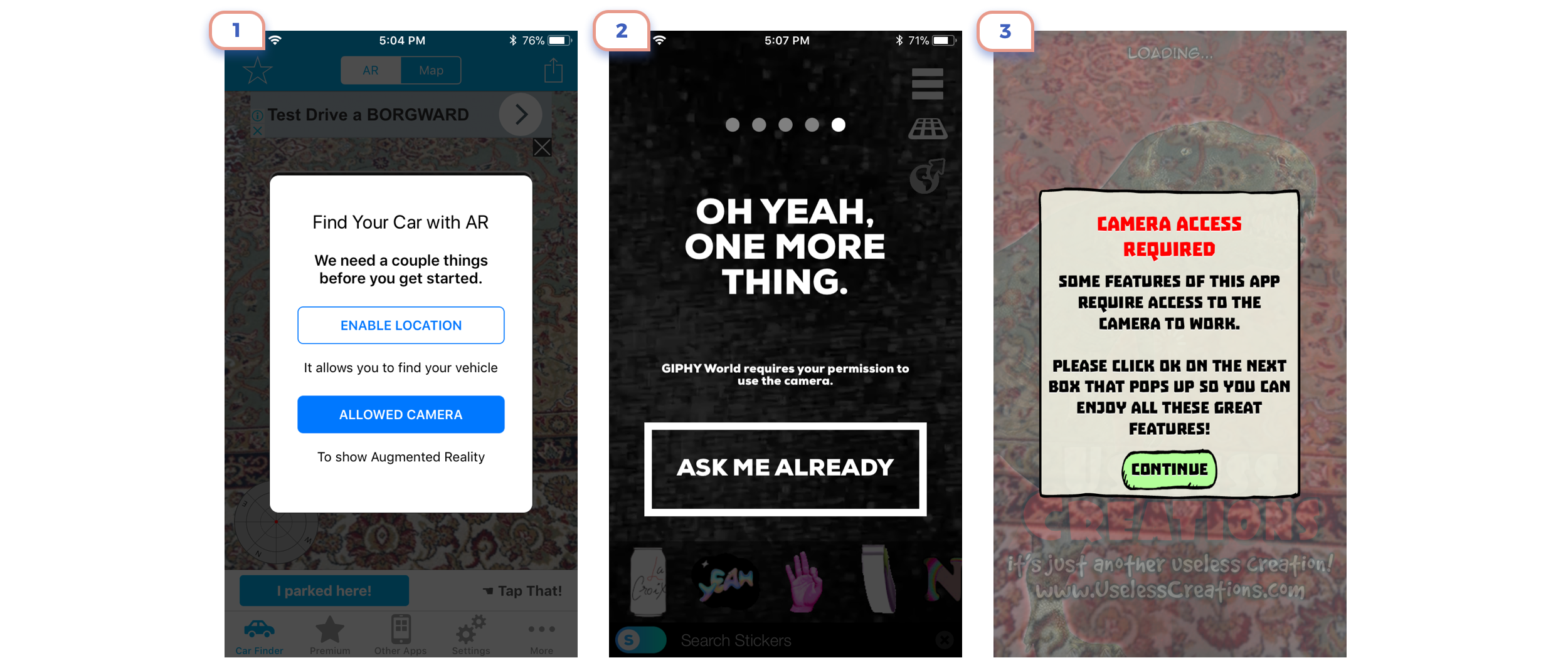
It’s interesting how developers care about users privacy. It’s lovely, but as for my point of view, clear message in default modal is enough.
4. Last preparations

So now we almost reached step when the app should open camera view and finally show augmented magic. Some apps show a short introduction here.
It can be an explanation of how ARKit works.
There could also be some approaches unique to the application. Four steps are too much for this case. Even the last illustration would be more than enough.
Four less good examples:
1. Unclear illustrations and unreadable text
2. Difficult to image four gestures at once before even seeing a scene.
3. Try to avoid redundant steps
4. One more example from “Before ARKit Era”. The takeaway here: don’t invent a bicycle.
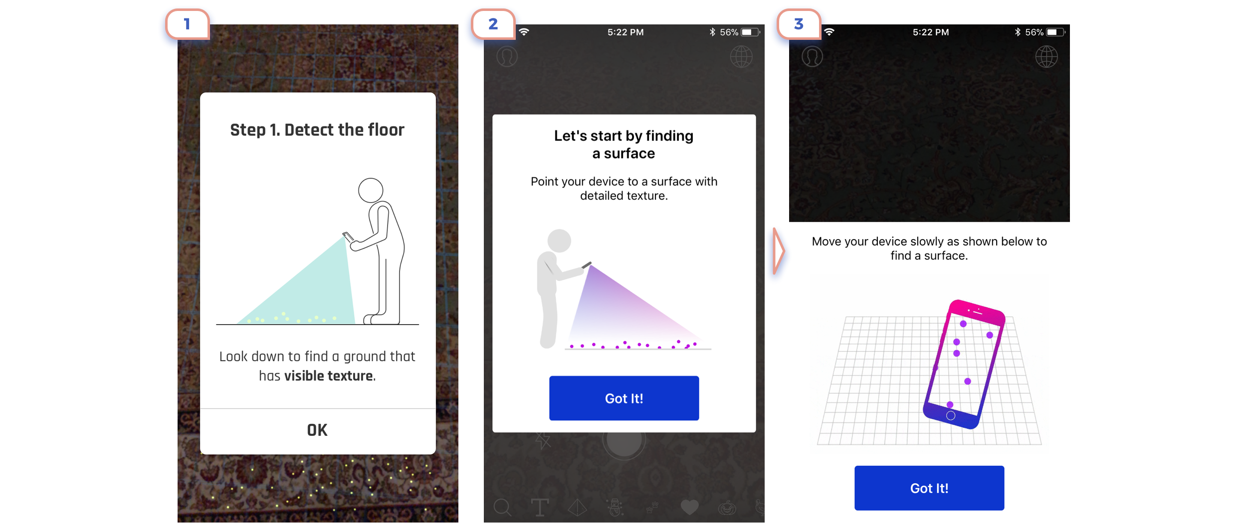
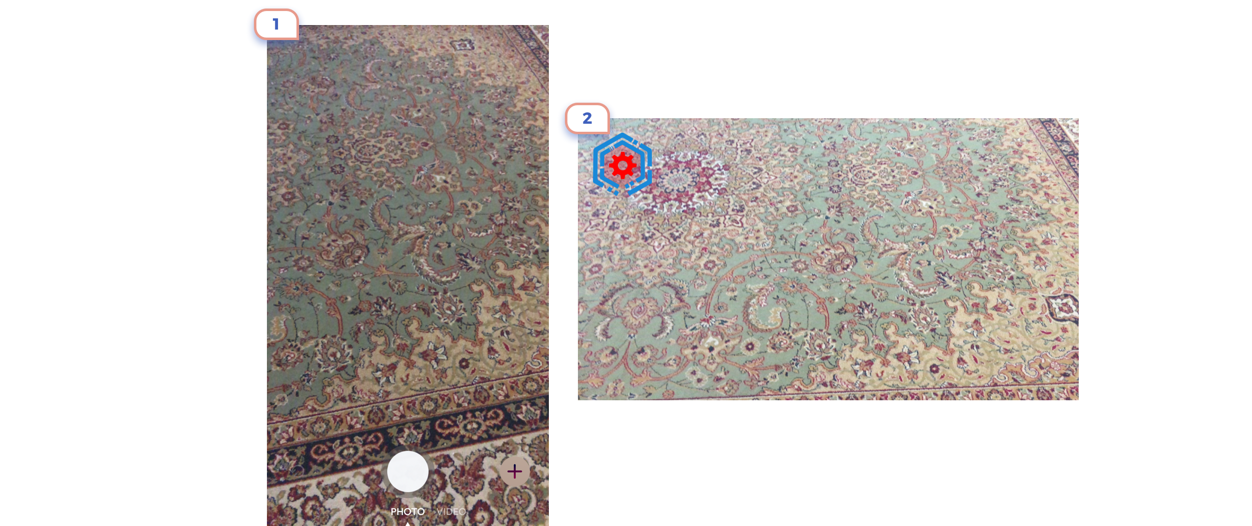
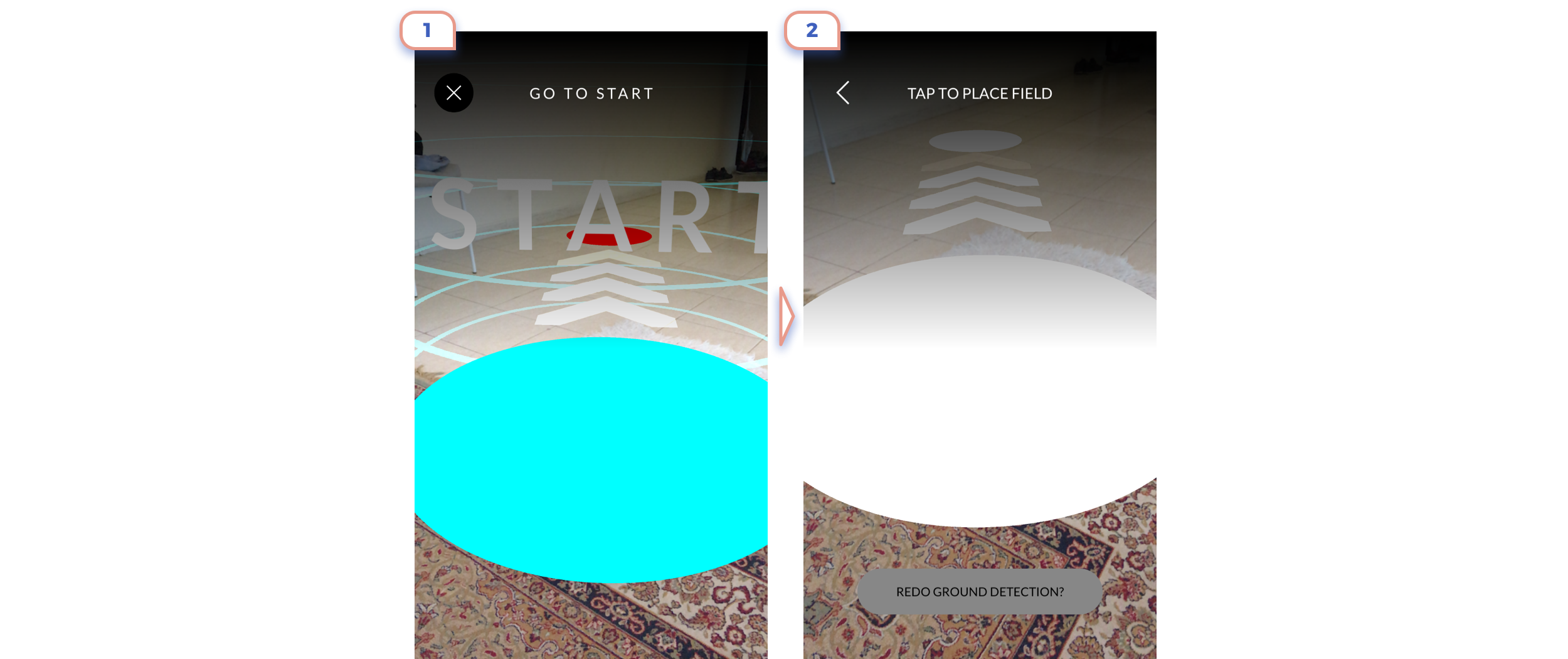
5. Scanning

So our user finally got opened camera view, but instead of playing with augmented object ARKit requires to do two more steps. At first, a user should scan the environment.
Here and later I’ll use my Persian carpet as background for augmented reality. It looks ugly, but there are reasons for this. At first, ARKit recognizes it pretty easy. At the second such environment is the excellent test for readability of texts and UI elements.
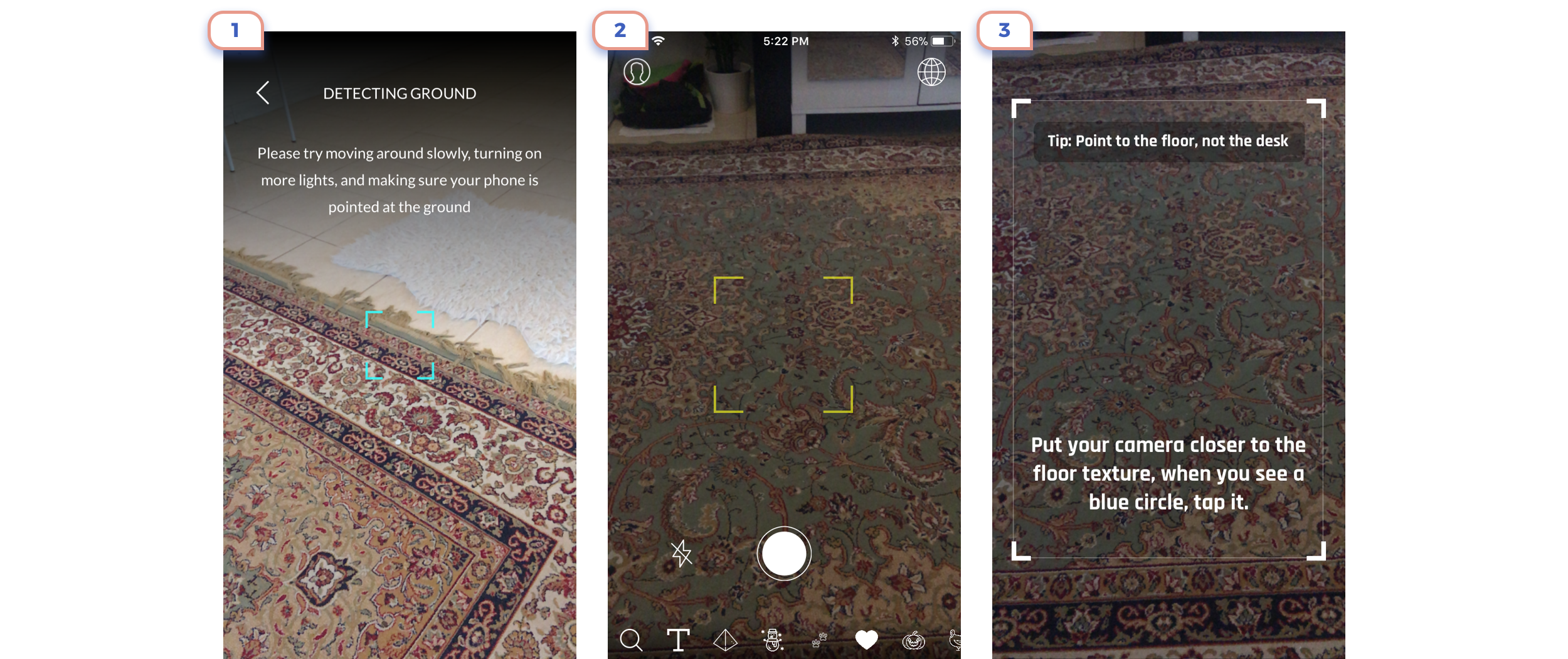
The best approach here just to show square and two words explanation.
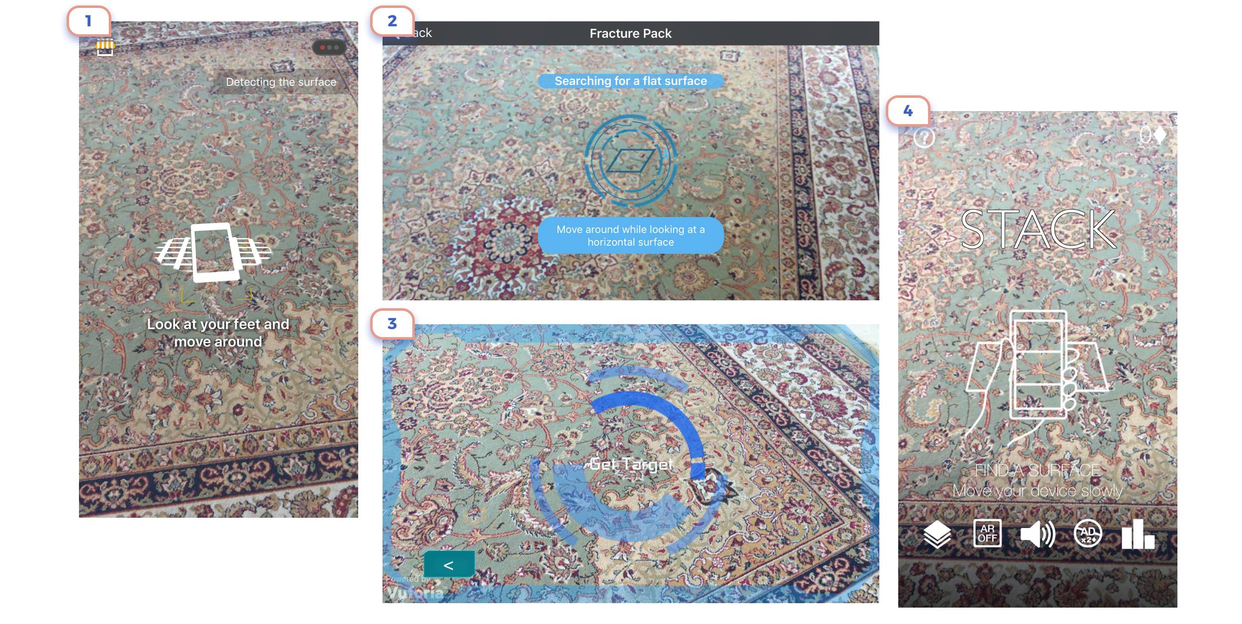
Using icons and more complicated graphics also works, but it doesn’t give a lot of value.
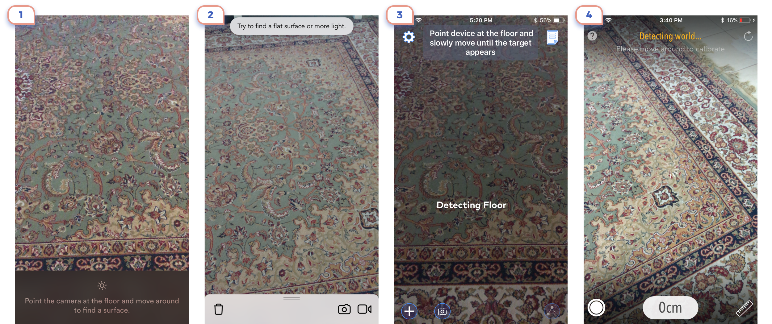
Better avoid using only text explanation.
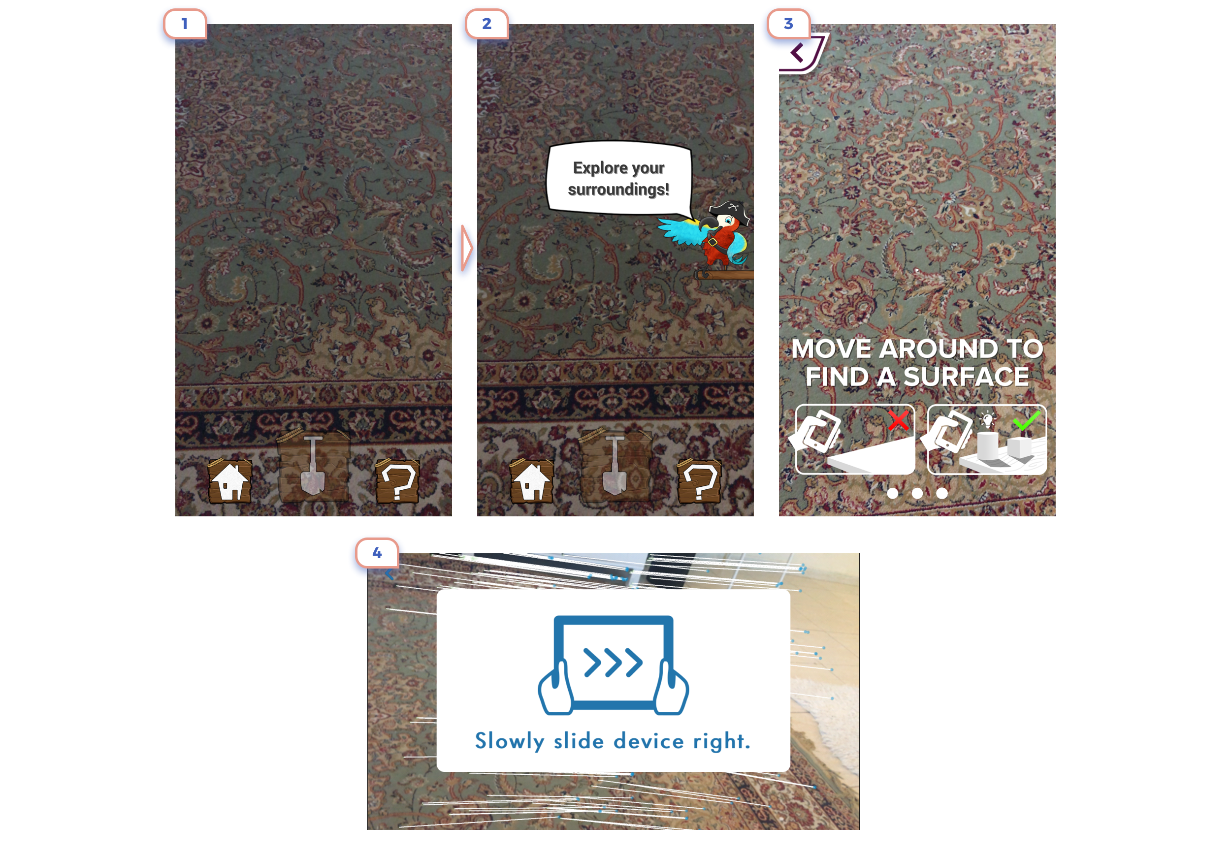
Few more examples:
1. First few seconds user is confused and have no idea what’s going on till parrot will give such no clear advice.
2. Good bold text, but not apparent icons.
3. One more reminder of how complicated was life in “Before ARKit Era”.
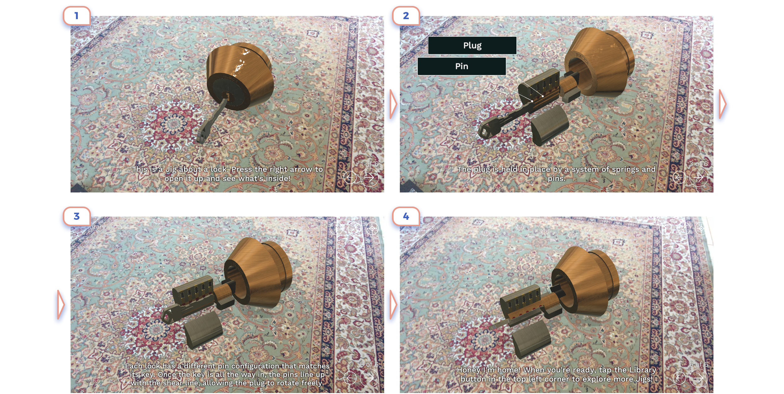
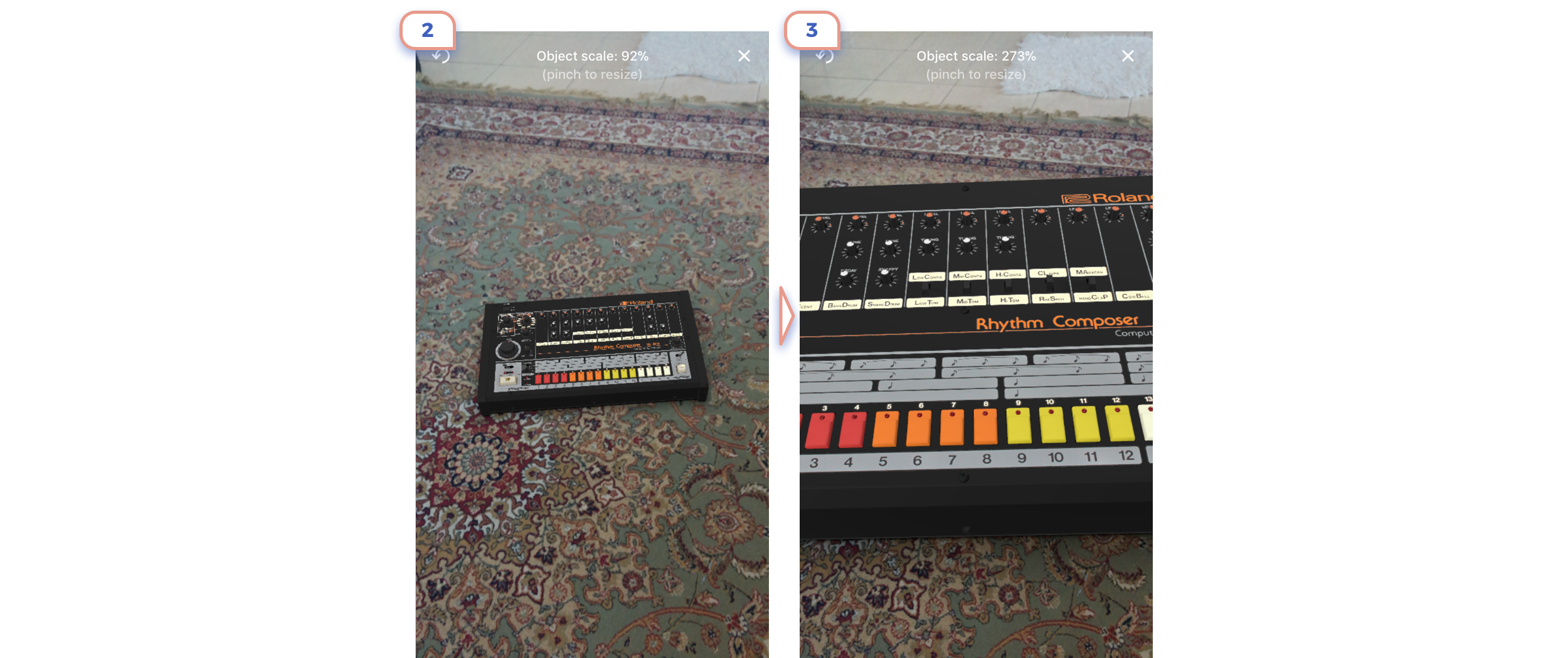
6. Placing an object
After ARKit recognized environment, a user should choose a place where he wants to put an object or start an action.

The most basic interaction here is just placing the marker on the surface. It can be an essential square or something more creative. Here it does not matter. Almost any design does its job well.
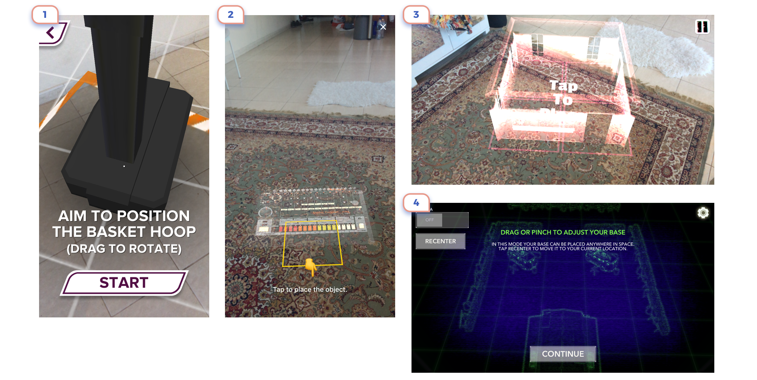
For some cases is a good idea to show the preview of placed object. You should make it entirely clear, that it is placing of the object, and what kind of interaction is required from the user. To avoid cases when first time user can have assumptions that it is already AR experience itself.
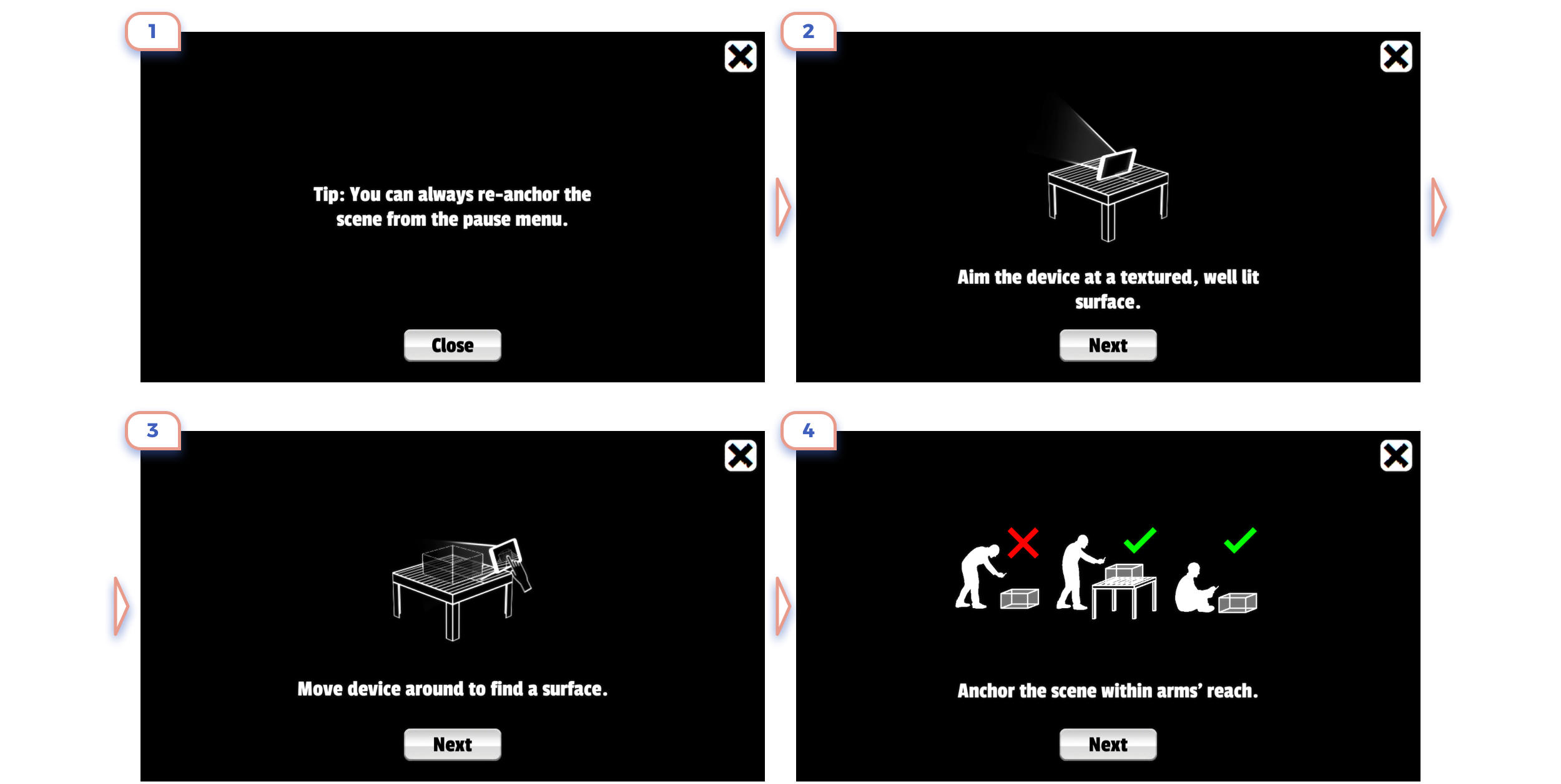
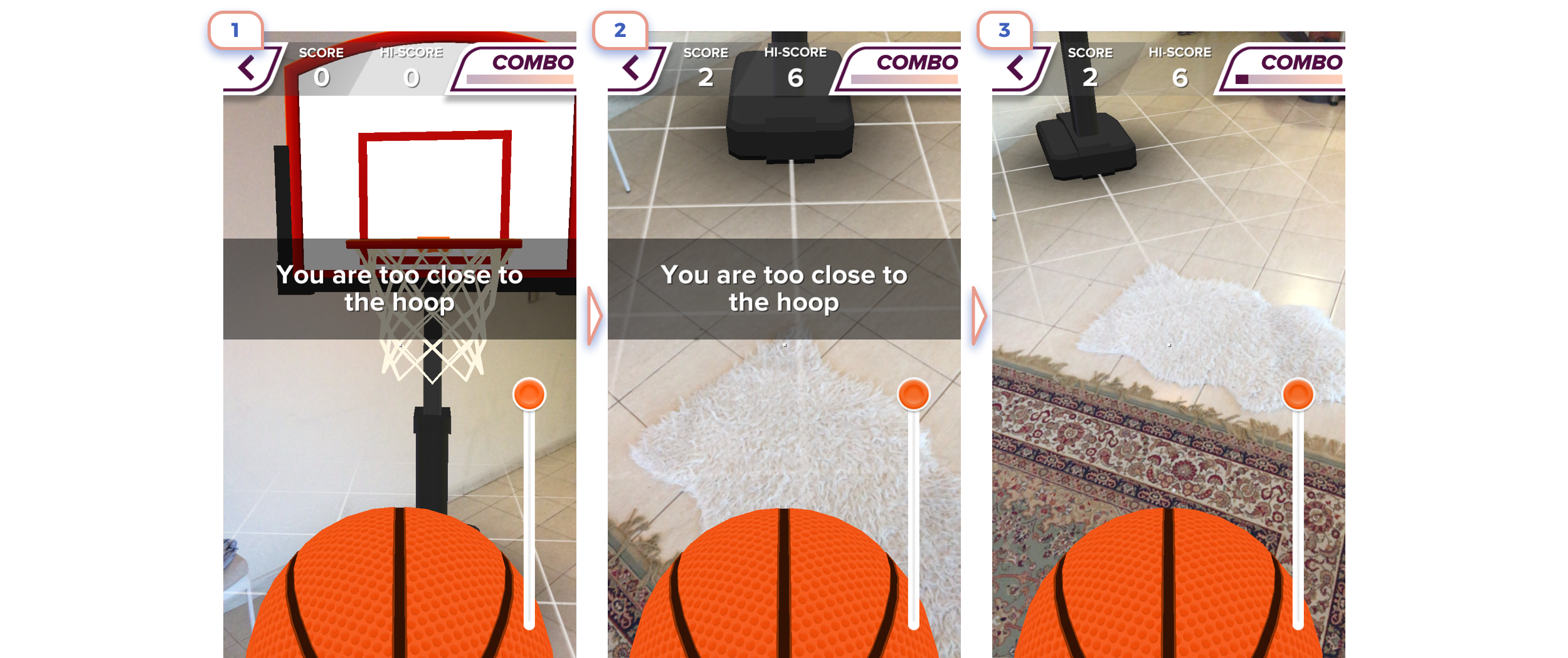
7. Tips

The main motto of whole augmented reality should be “Show, not tell”.
So better explain to the user how things work hereafter AR experience started. He can easier learn step by step and try.

This is a useful example of the nice flow with scanning, placing and explaining how to use. And all of this in a cute cartoonish style.
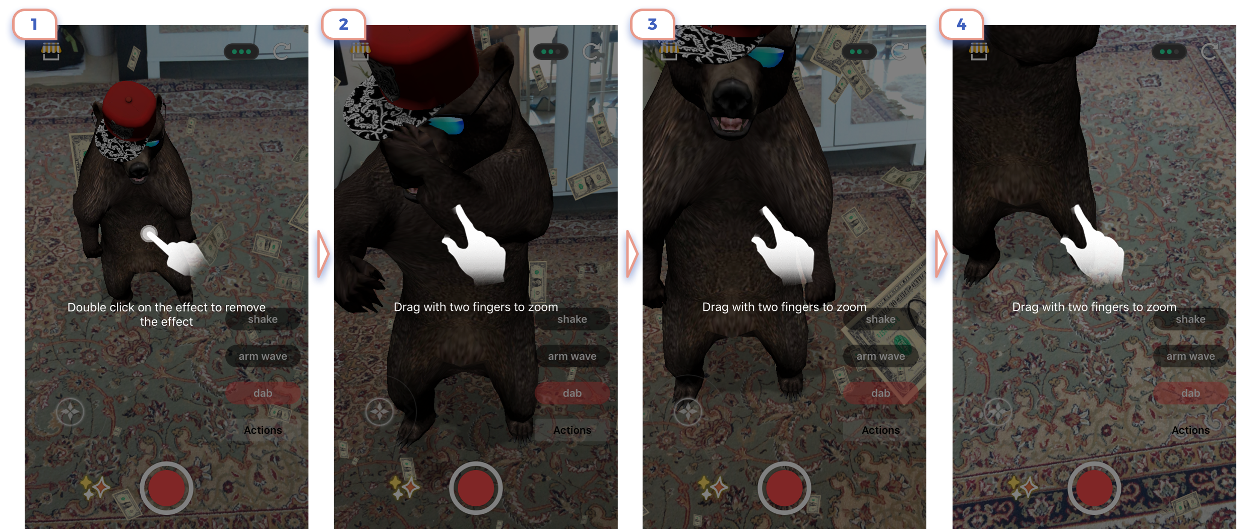
Here is one more example of tips on top of camera view. But I wouldn’t recommend paying so much attention to explain basic gestures like pinch to zoom.
This is the example that shows how unreadable and useless can be small text.
As much text you have, as less are chances that anybody will really read them.
Initially, I thought that text on a top is a bad idea as it’s too small. But practically it explains the basic action. If there are not any unique interactions, show small tips with basic things is fine.

In this game is the only single tutorial that stops whole experience and shows on a top. In this particular case, it’s okay because using this unique interaction built an entire game. But be sure that that you don’t pause experience for unnecessary information.
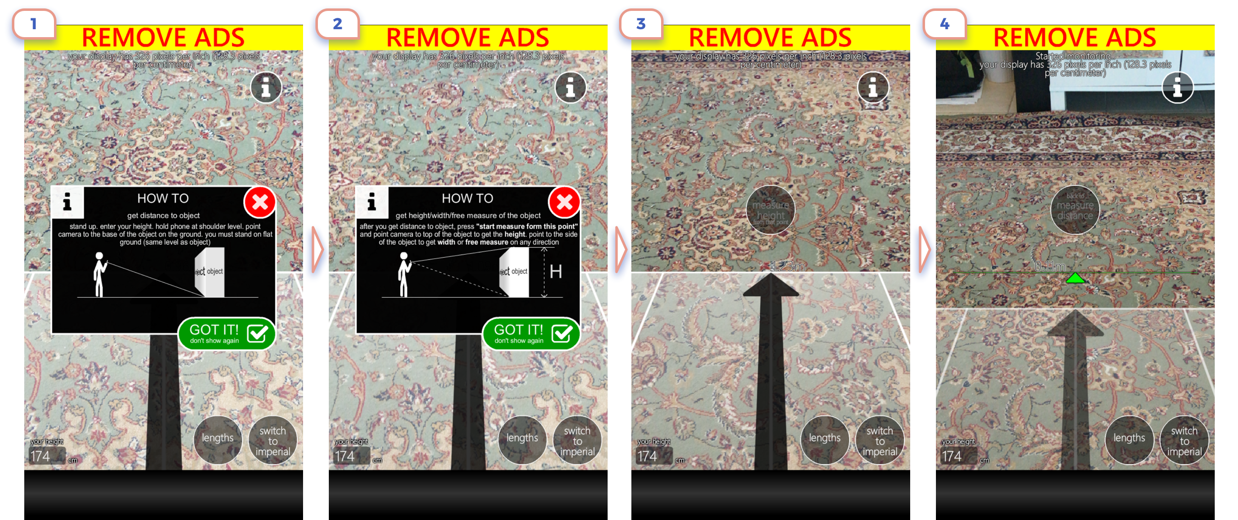
In this case, everything is terrible: small texts, unclear icon, pausing experience, “Remove ADS” label and useless app at all.

In this case, better have only two clear icons instead of stopping experience to explain unique gestures. Of course, a better way is just to use basic gestures and avoid inventing interactions. The second screenshot shows how unclear can be just text in a corner.
This example shows how messy UI decrease usability. And even detailed explanations will not help.

I know that it’s my fault that started this flow by clicking “Yes, Please!”. But two layers of popup didn’t help me at all. I appreciate the effort to sell upgrade of the app on the 5th page even before showing what app does, but I had to skip this step as six others.

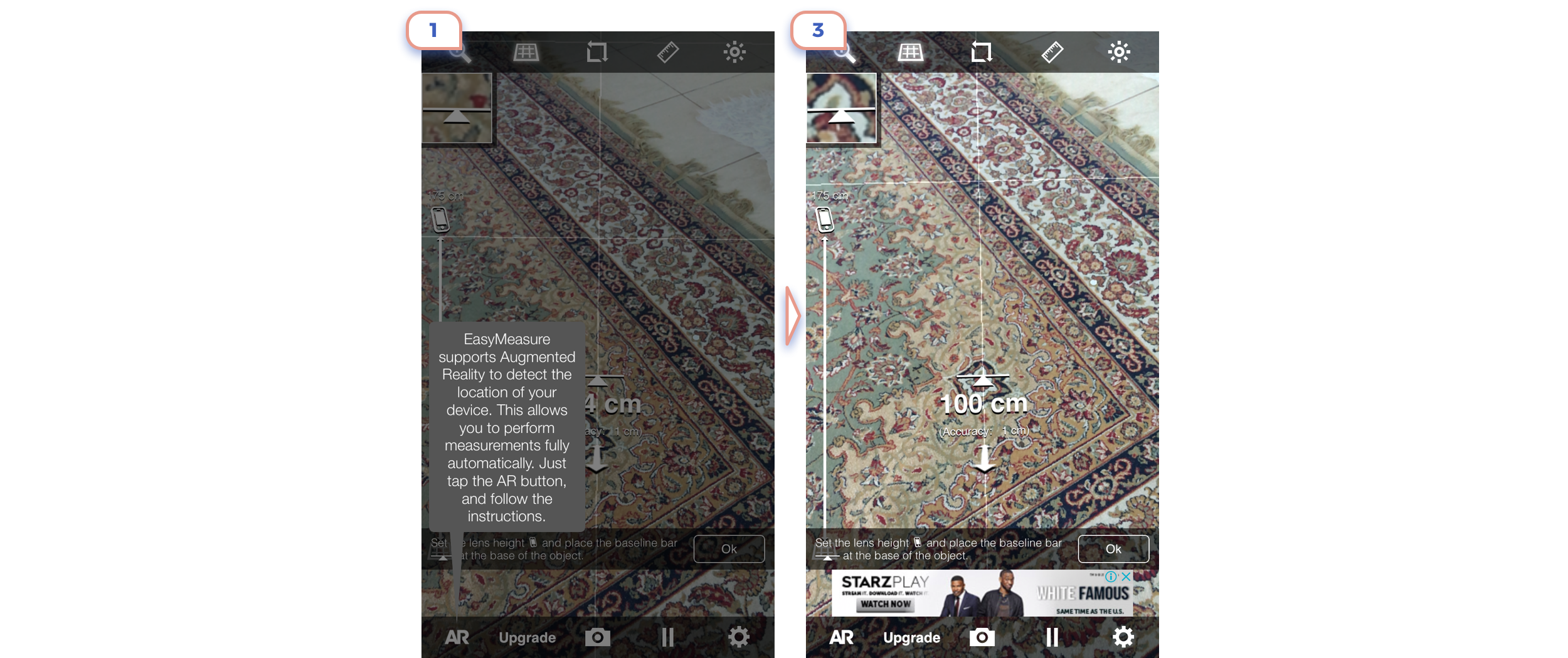
Placing short useful recommendation in the middle of the screen is good practice.

This app has a few UI issues. For example, the label “Tap + to ….” isn’t placed in a way that makes clear where that it’s related to this “+” button. But the overall experience is excellent, as the app just does what says.
This example has a comparable long series of tips, but they are not annoying and show useful information.
7. Learning curve

After we showed a user how to use our app, a user starts exploring the environment. On this point, clear UI and smart gestures are very important.
Even except not clear help in modal window UI is messy. Especially cool looks “Tap That” label next to the button.
On first example you’ll assume that you should tab white button, But not, you should tap “+” icon in the right corner to place an object. On the second screen, you should tap on a screen to put an object, not on this attractive button.
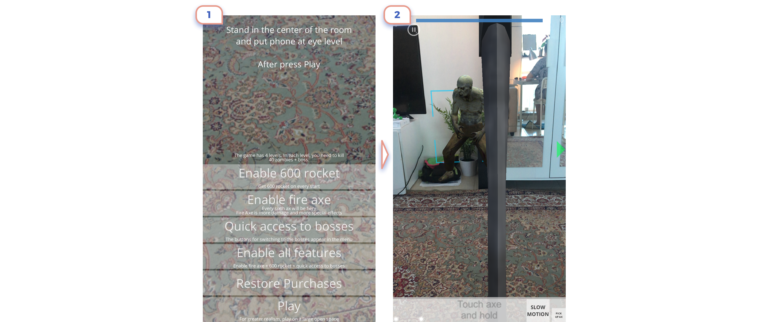
Bunch of settings on the first screen didn’t help e figure out how to kill a zombie using the axe.
Make sure that placed object isn’t too big.
The great example of bold and clear explanation.
8. AR as secondary feature

Sometimes augmented reality isn’t a central feature in your new app. Developers add AR as additional functionality. For this purpose, Apple created a particular icon (👇1), to make this action consistent across all apps. But honestly, I didn’t notice this icon in any of apps.
Also, a good idea is at least have a look at Apple guidelines.
There was a lot of screenshots and recommendations. Let’s summarize all of this:
- A user should reach camera view as soon as possible.
- Better avoid explaining basic gestures.
- Small white texts are unreadable on the AR view.
- An illustration is better than a text.
- An animated illustration is better than still.
- Make application unique by style and content, not by unusual interactions.
- If you want to introduce a new gesture, just check twice if there isn’t any default alternative.
- All the time ask yourself: is a there better way for a user to do this on regular UI?
- Don’t forget to write a short message about why your app needs access to the camera.
And the most important:
Don't tell, show.


